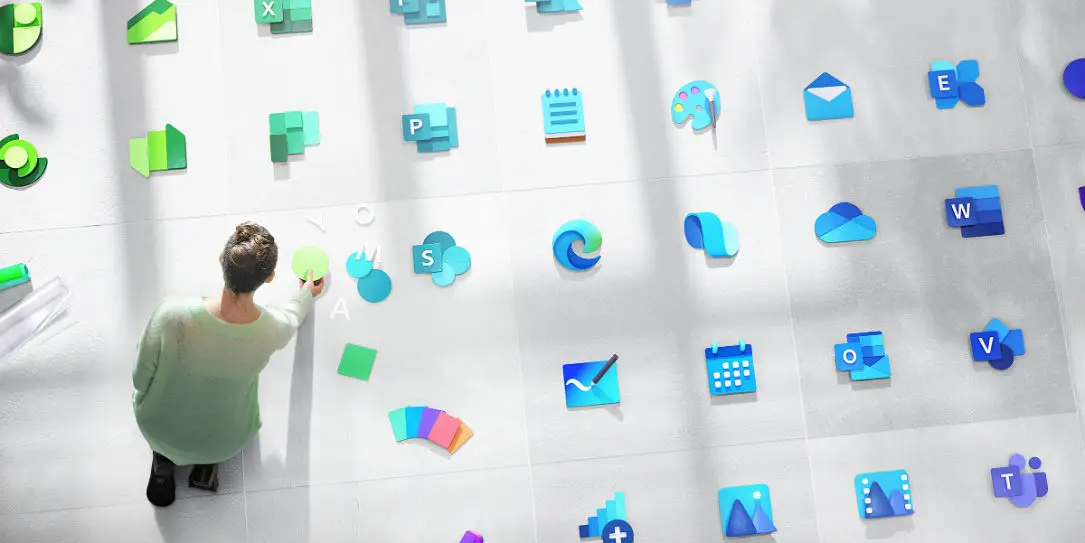
As part of Microsoft’s efforts to revamp its products and image, the company is now pushing its new “Fluent Design” language to its icons. The effort to clean up and redesign its icons started last year with its Office Suite and has now bloomed to over 100 icons being included in the redesign effort.
If you haven’t heard of Fluent Design yet it is, in essence, a simpler, flat, minimalistic design language that has cleaned up Microsoft’s branding aesthetic. Of course, behind every new design philosophy is an idea that drives it and Microsoft says converting these icons to Fluent Design “reflects this new world of work and was both daunting and thrilling.” The company is attempting to deploy this new aesthetic across its enterprise, small business, and consumer markets without alienating its market segments.
As with any major design change, Microsoft has had a few challenges to face. The company wanted to show some form of innovation while maintaining familiarity for customers. This is where the Fluent Design philosophy came into play. Simple changes like colors and even small adjustments to a few lines can go a long way in the end. Microsoft has also been taking user feedback on its new designs, which is always a plus and appreciated by users.
Whether our customers use their phone, PC, or VR headset to get work done, we wanted to reach people in every environment. The newest design guidelines helped us unify icon construction across the company and within each product family.
Microsoft
Currently, it will be only the icons that will receive the Fluent treatment, not the applications themselves. This doesn’t mean that Microsoft isn’t thinking ahead to a potential future update to its apps using Fluent Design though. There’s no word when the current batch of redesigned icons will hit users but we’re sure Microsoft will update us at some point.
What do you readers think about Microsoft redesigning its icons? Do they look good to you? Let us know in the comments below or on Twitter, Facebook, or MeWe.
[button link=”https://medium.com/microsoft-design/the-ripple-effect-expanding-our-icon-design-system-74b4d916b7a4″ icon=”fa-external-link” side=”left” target=”blank” color=”285b5e” textcolor=”ffffff”]Source: Mircosoft[/button]Last Updated on February 3, 2021.